Keith Haring and Artist Trading Cards

This slideshow requires JavaScript.

keith haring copy
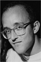
I have fallen in love with the art of Keith Haring.  It just makes me happy.  I love the simplicity of his art, as well as the messages he sends to us of tolerance and unity through his images.  He has left a wonderful legacy of images that represent love ankh heart copyd positive messages.  How can you not help but smile when you look at his art?

In the classroom, we focus on how Keith Haring shows movement, as well as the simplicity of his art.  He generally uses bright and solid primary and secondary colors and lots of color … hardly any white space … and outlining his images in black.  There are very few details in most of his work and he does a great job of showing movement through the placement of lines.  We also talk about “underground” art and street art, which is how Keith Haring became noticed – with his N.Y. Subway wall murals.  Even though “street” art is sometimes considered grafitti and the artists can’t sign their names, they have their own icon or symbol so people know who was the “contributor”.  Keith Harings was known as the Radiant Baby.  radiant baby copyYou can see how Haring included it as a “signature” in much of his early work.

The artwork we actually do is another “new” form of art… Artist Trading Cards.  Just like baseball, football, Pokeman cards, artists create their own Art Cards to trade with other collectors and artists in the medium they are known for.  There are actual conventions held for trading!

We did ours in the Keith Haring style of something or someone in “motion”, simply using Sharpies for the flat color Haring always used.  After focusing on the art and outlining everything in black, students made sure they included their lines that showed motion.

They turned out fabulous, if I do say so myself!

Leave a comment

Filed under 5th Grade, Artist or Focus, Keith Haring, markers, ~Blog~

Palm Frond or Lauhala Weaving

Aloha!  I am a great believer of creating art out of what is in our environment (natural or otherwise) and I am never more inspired than on the Hawaiian Islands.  There is a reason so many artists live there and there is an art gallery around nearly every corner and in every small town.

While visiting Ho’nau’nau, the royal refuge on the Big Island ths summer, I came across Toro Fujimoro from Kealakekua who was showing tourists the art of Lauhala Weaving.  Lauhala means “leaves of the Hala tree” in Hawaiian … Hala being Palm.  The Coconut Palm is considered the “Tree of Life” in Hawaii.  It wasn’t just art objects woven from the palm fronds, but essential things like bowls, hats, baskets, and mats, as well as toys.

Toro taught us the beginner project of weaving an Angel Fish.  Here is my final result.  Leaving and fraying the ends of the fronds create a beautiful long tail of the fish.

Since my meeting up with Toro I am very interested in this type of weaving and am itching to get at my neighbors tree … (-:  I purchased a used instruction book on the subject  and am looking forward to experimenting more with this art form.  “What are Fronds Fro?” is a great book for beginners.  It now only has very good instructions for projects, but talks about proper frond preparation etc. (not too much water in the frond!)

Palm fronds aren’t the only material that can be used to weave … how about ribbon?  or paper strips?! 

Leave a comment

Filed under ~Blog~

Street Art – Behind the Scenes

Exit Through the Gift ShopMy son, who is very interested in street artists, recommended I watch the movie, “Exit through the Gift Shop”.  The movie was nominated for an Academy Award for Best Documentary and  I watched the movie this past rainy day weekend thinking it was going to simply be a documentary on this counter-culture underground movement called Street Art.  It was so much more … at the end of the movie you should ask yourself two questions, “What is Art?” and “Who decides it’s Art?”  There has been a lot of speculation as to whether or not the movie is “real” or not … I’m not sure it really matters, in the end.

Without telling you too much about the movie and giving away the good stuff, the movie was made by the most famously anonymous street artist, Banksy.

An amateur filmmaker, Frenchman Thierry Guetta aka “Mr. Brainwash”, shoots reels and reels of film on the pretext that he is making his own documentary about street artists and their nocturnal pasting and spraying.  There are many interesting focuses on different artists, most notably Banksy and Shepard Fairey (founder of Obey and the artist made famous by his iconic Obama image), who allow the filmmaker to go along on their adventures.

The drama intensifies and in the end … well, I think it has a wonderful twist.  I thought it was interesting how bitter the street artists were in the end.  Did “Mr. Brainwash” sell out?  Is he smarter than everyone else?  Is he a fraud?  Is “Mr. Brainwash” nothing more than a character made up by Banksy himself?

All in all, it is a very entertaining and interesting movie!  Let me know your thoughts!

Leave a comment

Filed under Artist or Focus, Medium, Paint, Sparks~Inspirations, Street Art, ~Blog~

Pulp FASHION – Paper Art

Men's costumesLast week I visited the fantastic exhibit at the Legion of Honor in San Francisco … Pulp Fashion by Belgian artist, Isabelle de Borchgrave.  The fashion was life-size period costumes made from nothing other than paper and paint (of course it was either glued or stitched together).  Not only did I thoroughly enjoy her beautiful, realistic creations, but I really apprecThe artist at workiated the thorough explanation of her process.  The video was well done and you could get “up close and personal” with her art.

The costume time periods ranged from the renaissance period to modern-day Coco Chanel.

De Borchgrave uses stencils and other techniques to re-create the uniformity of fabric and I especially liked the use of metallic paint.  That really made it look like silk.  The foundation paper is quite thick and looks to be very heavy and resilient.  The lens paper lace was fantastic and all the tucks and pleats … mind-boggling!  White dressesBeads and hair pieces, and even the hair itself, if necessary, was made from paper.  Every piece was a little different and had a different flair and inspiration.  All the pieces were exhibited on simple paper mannequins.

In theNeapolitan woman last exhibit room was a presentation of costumes De Borchgrave created using actual paintings in the Legion of Honor for inspiration.  They were incredible!

At the end of the day … we decided that it was impossible to decide on a favorite.  We even tried to break it down by room,  Everything was beautiful and different.

Not only did I have a great day with my good friend, Linda, but was really inspired by the creative use of paper and stencils and how it could be translated into the “real thing”.  I have pulled out the mylar, the textile paints, and the tees to create my own stencils and give it a go.  My creative juices are flowing!!

Leave a comment

Filed under Medium, Paint, Paper, Sparks~Inspirations, ~Blog~

Beautiful Botanical Illustrations in Fifth Grade

I am constantly amazed at the skills of my students and this project was no exception … especially with regard to the boys.  Painting flowers isn’t generally their favorite thing to paint, but it takes a lot of patience to paint botanical illustrations and they were up to the challenge.

They were BEAUTIFUL!

This slideshow requires JavaScript.

We began with quite a bit of discussion about how the point of botanical illustration is to accurately record the plant in all its forms.  Botanical Illustrations began as a scientific study that turned into an art form.  Artists work very hard to exactly represent the plant, down to dissecting the pods, showing what it looks like underground (roots, bulbs etc), showing leaves,  flowers and other parts in all their different forms.  Then they “glaze” watercolor in many sessions to get the colors just right.

I had a wide selection of plastic fruit and flowers for the students to choose from and they started their drawing.  Of course, we didn’t worry so much about the roots etc, just the flower/fruit and a stem and leaf.  Given our already tight time constraints, they worked exceptionally hard to get as far as they did.

After the sketch was done, students used watercolor pencils to add the color.  We talked about the blending of colors and how that helps with low lights and high lights and showing where one pedal ends and another begins (or one grape …)  I asked them to work with a minimum of 3 colors … starting with yellow (which I believe to be the foundation color for nearly all things “natural”.  

Being fifth graders, they have a really good background in color from all our other classes and they did a remarkable job thinking about color mixing and how it would help or hurt their painting.

All in all, it was a great send-off project for my lovely fifth graders… they are off to middle school!  This is my first group that I have taught from first grade on up and I really believe it shows in their work!  Good luck to them all!

Leave a comment

Filed under 5th Grade, Artist or Focus, Botanical Illustration, flowers, Medium, Paint, Watercolor, ~Blog~

The “Wild Things” are Here!

One of my all-time favorite children’s authors is Maurice Sendak … I have spent hours reading his books to my 2 boys and everyone knows his iconic “Wild Things” from the book Where The Wild Things Are”.  I was looking for something to re-energize my second graders and this was the thing to do it!  We had a blast making our Wild Things Masks!

Since all of the “Wild Things” in the book were based on real-life characters in Mr. Sendak’s book, I asked students to think about the personalities in their lives and create their Wild Thing around them.  I’m pretty sure that there was some embellishing of characters, but isn’t that what artistic license is all about?!

This slideshow requires JavaScript.

Starting with tag paper, students drew a large head that took up most of the paper.  Sendak’s characters were all bigger than life, physically and in personality.  The shape of the head was at the discretion of the student.  I gave them templates to help make big eyes, as all of the features in Sendak’s characters were large too.  We talked about dimension and how that means there is something that pops off the paper.  I was expecting that at least one feature on their mask was going to pop off, giving some dimension to their character and making it more life-like.  Students are familiar with manipulating paper from first grade projects and it all came back … accordions, corkscrews, twisting paper, cutting a tab to make the horns stand out etc.

Using pastels, students colored like mad.  Everything had to have color!  Then they got down to the fun of putting dimension on their mask … a tongue sticking out, jagged teeth, horns, hair, a beak – you name it, we had it.  It was wonderful!

After all the dimension was put on, students were given googly eyes and feathers.  I hold these myself took help keep things under control … especially the feathers!

If there was time … students then cut out their mask!  I think Maurice Sendak would be proud of all imagination and creativity that went into our Wild Things!

Leave a comment

Filed under 2nd Grade, Artist or Focus, Maurice Sendak, Medium, Paper, Pastels, The Art Room, ~Blog~

Easy Peasy Printmaking

How did they make more than one copy of a book before the printing press?!  What do you mean there was no such thing as a copy machine?!  A typewriter?!  Carbon paper?!  What the heck?!

The printing press was an invention that truly made the world a better place.  In 1440, Johannes Gutenberg invented a way to make multiple copies of books and mass media.  Before movable letters and numbers, books were re-written and illustrated one by one and were only seen and owned by either the church or the very rich.  Having books, illustrations and printed media produced by a press meant that the more common person could be educated and break the cycle of poverty and repression.

With the above in mind, printmaking in art is Printmaking is the process of making multiple pieces of art, where painting makes only one piece of original art.  The prints are made from a single surface or plate and creates an “edition” that is signed and numbered.  Artists will either carve or make a raised image on the surface of a plate using wood, stone, plastic rubber etc.  The then ink it and make a print.

Our 5th graders made their own printing plates using styrofoam (you can buy these through Blick … Inovart foam).  Our ink was simply black tempera paint.  I gave students a piece of scratch paper to play with their designs first.  They transferred the design to the plate by placing the paper over the top of the plate and redrawing.

Students carefully etched their design into the plate, making sure they had a deep groove.  Remember … this will be a negative image!  If you are writing on your plate, make sure it is a mirror image or it will print backwards!

Instead of expensive (and messy!) brayers that roll on a uniform amount of ink, we carefully brushed the paint over the plate until there was a very thin coating of paint.  Too much meant a messy image and too little meant a spotty image.  I don’t give students water … it creates a huge mess and only serves to water down the paint, making it difficult to get a good print.

Lift/peel your paper from the plate and see how you did.  Didn’t work?  These plates are meant to be used over and over!  Try it again … (-;

Leave a comment

Filed under 5th Grade, Artist or Focus, Paint, Printmaking, ~Blog~

Kan U Kandinsky?

Today I asked the Kindergarten classes this same question … and the answer came back a huge “YES!”  Their art work today was beyond even my optimistic dreams!  It was a perfect project for a warm Spring day … full of bright glorious color!

This slideshow requires JavaScript.

Before exploring our Kandinsky Style, we talked about shapes and how everything you draw is made up of different shapes just modified in your mind to tweak a little and make up the whole.  A simple example is a house … what shapes do you use to draw that house?  Rectangles for the structure, triangles for the roof, square for the windows, and so on.  We then moved on to something a little more complicated.  If you want to draw an elephant, you would start with an oval for the body adding some wrinkles and details, a tube for the nose, ovals for the ears adding wavy lines around the outside to make it look more realistic, etc.

We then talked about Wassily Kandinsky, the russian artist credited with painting the first piece of abstract art that was made up wholly of shapes.  Showing them his famous painting, Concentric Circles … we now had our theme.  I reminded them to look closely at his painting.  Did he worry about the colors mixing?  NO … it only added interest to his painting so, don’t worry about it!  I think that was very freeing for many of my art shy kinders!

We talked about how to use the tempera cakes neatly and how to keep the colors clean without too much water.  They did a great job dabbing their brushes on the paper towel and the applying the paint.  You will notice there is no black or brown … I only give those colors out sparingly and for particular projects because the project tends to lose it’s brightness and we are dealing with “mud” at the end of the project.  (:

Using 12×18 heavyweight paper, we folded our paper together in half 3x to make 8 rectangular sections to begin our shapes and concentric rings.  They then chose what shape to put in the centers of their paintings.  I encouraged alternating colors for the rings, but some had their own idea about what they wanted to do, which is great … that is what individual creativity is all about.

A little note … I also did this project in our younger special needs group and while I didn’t take pictures )-: they were also very successful.  We scaled back the project to only 4 very large sections and a limited amount of paint.  We had lots of smiles!

Leave a comment

Filed under Artist or Focus, Kandinsky, Kindergarten, LASS - Special Needs, Medium, Paint, shapes, The Art Room, ~Blog~

Picasso Heads in Second Grade?!

This slideshow requires JavaScript.

Second Graders (!) did these fabulous Picasso Heads!  They really got into the spirit of Picasso when they drew and “painted” them with oil pastels.  It was very exciting to see how they embraced the fact that not everything needs to look exactly like the real thing … even my very linear thinkers stepped out of their comfort zone for this one!

We first talked about the use of color and shapes in art to communicate feelings and meaning in a painting.  Using Picasso’s Portrait of a Womanthe use of blue and cool colors, triangle for a tear, a white/open circle where her heart is, shows us she is very sad.  We then moved on to the painting, Girl Before a MirrorThis is an excellent example of Picasso’s use of shape and color.  Also, Picasso many times would put a line through the face to show that the subject has more than one personality or many sides.  He also outlined everything in black to accentuate his color.

Students drew 3 heads that touched … representing a relationship between their characters.  They then had to draw a line top to bottom on each head showing the 2 sides of each “person”.  Using shapes for features, students began building the personality of their Picasso heads.  We talked in simple terms about what shapes might represent.  A heart for a mouth, corkscrew for eyes, etc.  Of course, crazy shapes for hair is a given!!!  After pencil, everyone outlined in Sharpie – their choice of thick or thin lines.

For color, we used oil pastels.  I introduce the fact that oil pastels aren’t really glorified crayons.  There is a reason for oil pastels.  The pastel goes on nice and thick, but pastels are made to be spread and blended like paint!  We use Q-tips to make the pastels look like oil paint and get a heavy coating of color.  The use of an everyday item in our art always gives the students a little thrill and makes them think, “what else can I use?”  (and no one put them in their ears …  (-:!)

OUR RESULTS WERE FABULOUS!

Leave a comment

Filed under 2nd Grade, Artist or Focus, Faces, Medium, Pastels, Picasso, ~Blog~

Felting Wool, Making Fingerless Gloves, and “Upcycling” Textiles

I began my creative exploration as a child by learning to sew with my Grandmother.  I have always been very inspired not only by the texture of fabrics, but the unique personality given to the fabrics with dye and the printing.  My personal stash of fabrics can rival anyone (just ask my husband!) and I find it hard to walk out of a fabric store without adding just a little something more … in case that perfect project comes up where I might need it desperately.  LOL  I save every little scrap of things I love, cut buttons off old clothes for the next project, and buy at thrift stores, flea markets, and antique sales.  It is amazing what can be created from an old tablecloth or a well-loved pair of jeans!

My newest creative urge has been to “felt” wool sweaters and make fingerless gloves, mittons and accessories from the wool.  I have scoured thrift shops for inexpensive, nearly wool sweaters made from animal fur.  I have found cashmere sweaters with a couple of holes for 5$!  The sweaters made from about 80% or higher in wool that contains animal fur works best.  Blankets, suit coats etc. work well too and you get even more “felt”!  Have you ever accidentally put a sweater in the wash only to have it come out looking like a children’s sweater and have it be incredibly dense?  This is exactly what you are shooting for with felting because when the wool is cut it won’t ravel and you can make pretty much anything from it!

The felting process is simply to wash the wool item in hot water, rinse in cool and then dry it in a hot dryer.  Some sweaters need a little encouragement and might need to go through the process 2-3 times.  If you are doing a lot of sweaters, it is recommended to put your items in a mesh bag so all the fibers don’t muck up your machines … In the “olden days” they would call this boiling wool, only they actually DID boil it in a pot of water over a hot fire!  They used the “boiled” remnants for extra warm blankets and coats.

Now that your wool is ready … the game begins!  How do you want to cut your items out?  I like to cut at the seams and spread out my sweater so I can see just how much wool I have, look and mark any holes I need to work around, and get a good picture of the design I might be incorporating into my hand-made, one-of-a-kind product.  I have been known to use a men’s sweater collar for a decorative cuff and I like to use the bottom of a sweater or the sleeve cuff for the cuffs of gloves etc.  Pin your pattern and cut it out!

Since your wool doesn’t fray you don’t need finished seams (which is why I do this in the first place) you can easily construct just about anything from your wool … purses, hats, mittons, decorative items, flower pins, scarves, headbands – pretty much anything goes!  Decorate your item with embroidery, buttons, ribbon, complimentary wool or whatever is appealing to you.

Leave a comment

Filed under Recycling/Upcycling, Sparks~Inspirations, Textiles, ~Blog~